Worlds Without End Redux

Welcome to the not so new but certainly improved Worlds Without End! If you’ve been here before you’ll no doubt notice some pretty big changes. (If this is your first visit, you just have to trust me when I say it just keeps getting better.) Our goal was not a total re-design but rather a face lift – just a nip and tuck here and there – to freshen things up a bit and return that youthful glow to the site.
Why the changes? Well, this is the internet and you have to update your site once in a while if you want people to keep coming back. Nobody likes a stale site. But more importantly we keep growing and changing our content so we needed to update our navigation to help you guys can find the good stuff. On top of that our Google stats are telling us that lots of people are finding the site but most of our visitors aren’t going any further than our blog. They seem to be writing us off as "just a blog" when we have so much more to offer than that.
Here is a list of the major changes we’ve implemented to address these issues:
- New Home Page
We moved the blog out of the home page and gave it its own section. The new home page has links to the latest blog articles and a slideshow to highlight our best posts. Having a proper home page also gave us room to tell folks about some of our site features and the new content that gets added every day like new novels and authors and the latest member submitted book reviews. - Main Navigation
We were fast running out of room for links in our old menu and sub-menus so we opted for a mega menu approach. Hover over the main menu items and you can see how the mega menu drop down gives us plenty of space to show off the breadth and depth of our content while allowing ample room for future growth. We also re-organized and simplified the navigation and grouped all the social stuff – blog, forums and links – to the far right. - Giant Footer
We took the "new stuff" bits out of the footer and put them on the home page where they’ll get more attention and replaced it with a constant site-map. The new footer shows off all our content at once and makes it easy to see where you are and where you want to go next. - Re-Organized the Books Section
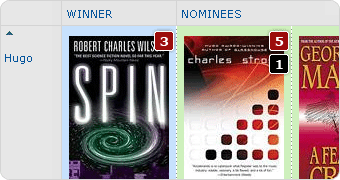
This is where the rubber meets the road for WWEnd. It’s all about the books. In this section we cleaned up the sub-menu, killed off the award info pages and moved that content into a hidden slide outs on the award list pages and changed the book list pages to the full width template so we could get more columns in and make them look as good as the awards pages. Check out the SF Masterworks list to see what I mean.
There are a ton of other small changes throughout the site that you may or may not notice but hopefully they’ll all add up to a better user experience. So take a look around and let us know what you think of the redux.


 Full Details


10 Comments
Working hard, I see. Very good. I especially like the changes in the book section. I think the wider format really works better there.
Thanks Glenn! Glad you like the improvements. The book lists changes really work for me too. I just love the cover galleries.
Awesome. Not only a facelift, but a marked improvement in navigation! I would like to see the font size of the headings "Books" "Authors" "Publishers" etc. a little bigger, but that’s just esthetics. A great change is the addition (or is it really the separation) of the "Blog". Playing around to check out all the other possible "amendments". (Just check the "Member Entry" scroll down box at the very top – the usual logon box does not appear there anymore.)
This looks great! I love the new menu organization. However, on the blog page, the sizing of the menu is a little off from the other pages.
@Emil: Thanks for the kind words! I think you’re right about the menu font being a bit thin. I’ve changed the font and made it bold to stand out a bit more. I guess I should have mentioned that the log-in has been moved into the My World drop down. Makes more sense there and taking it out of the top tab has left me with room for more wallpapers and those are fun to make.
@Allie: Glad you like the changes too. If you would, can you send me a screenshot and some details about your browser and system? The menu works in all the browsers I’ve tested in so I can’t see what you’re getting. Thanks for the input.
I do miss seeing the daily picks at the top of the page. I like the idea of books as decoration, and so I really enjoyed seeing that row of books as the first thing I noticed on the page. It also made it very easy to click them to find out more if I didn’t have much time to read through the site.
@Mattastrophic: Yeah, I kinda hated to let that go but I needed the space. The random reads is still on the home page but in a smaller space. We’re going to tweak that out a bit still too. Maybe do a cover flow or something. If you use iGoogle we have a gadget there for the random reads so you can include it on your home page.
It is beautiful. Really well done and snappy. Modern. Works very well in my Google Chrome browser.Quick question. I remember a section that showed what the highest rated books were as per WWE-ers. Is that gone? That would be nice in the "Book Lists" menu: WWE Top Books (it already has top nominations). Wonderful. Awesome. Congratulations.
@Wintermute: Glad you like the updates! We’ve talked about having a highest rated books list but it’s not come about yet. What you saw was a placeholder for a list that never materialized. We’re working out a proper algorithm based on number of reads, number of ratings and overall rating etc. We don’t want a book with a single 10 rating counting more than one with a 9 that has 200 ratings. It will make an interesting list.
Sorry, the comment form is closed at this time.